or
“Why The Best Symbol is the One That Gets the Job Done”

For at least the better part of a decade, tech bloggers and designers have batted blog posts back and forth discussing the necessity of replacing the old floppy disk “save” icon with something more “timeless”. Basically, the issue boils down to the fact that (almost) no computing devices use floppy disks as storage devices anymore, which purportedly makes the continued use of the “floppy-save” symbol confusing and anachronistic.
Over at Branch, there’s a high-level discussion taking place between designers attempting to actually figure out what a new symbol to represent the “save” function could look like. Some of the ideas include a dot that shrinks or fades inside a circle to indicate how much time has passed between saves, a “donut” that fragments to illustrate points in a “save cycle”, and an arrow pointing to the lemniscate (infinity symbol). All interesting ideas, but all are ultimately a little too complex, too generic, and not particularly fun or friendly.

Those who believe that the floppy cannot represent saving a document because nobody uses real floppy disks anymore miss an important point: while symbols initially piggyback on the meaning we assigned to a material object in order to stand in for something more abstract, once a symbol is used often enough, the symbol itself is enough to carry meaning, and the material object is no longer important. (You could think of the physical object upon which a symbol is based as a kind of scaffolding). This is how all symbols operate, by the way. Once any symbol enters a culture’s visual language, the physical object it was initially based upon is no longer really relevant.
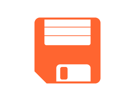
If we look at the floppy disk save symbol, there are a few things to consider. First, it’s a fairly unique symbol: a rounded square with one ‘bevelled’ corner, with two rectangles of differing sizes inside it, the smaller of these with another smaller rectangle inside of it. It’s immediately distinctive, unmistakable, and reproduces extremely well at a variety of sizes. Next thing: the floppy-save symbol is kinda fun, insofar as it references something from ‘another time’. You certainly don’t have to know what a floppy disk is to use the save icon (to you, the symbol may just be “the square with one corner cut off”), but it’s interesting to know that the symbol has a history. So far, there’s nothing really wrong with the symbol. It does its job.
If we’re picking on the floppy-save symbol, we may as well take a look at other symbols to see whether they’re similarly ‘anachronistic’. When we see a stylised depiction of a cog in an interface, we immediately recognise that it stands for “settings”, even though few of us have cranked any heavy cog-based machinery recently. Similarly, I suspect few of us use magnifying glasses to search for physical objects, but in a digital interface, we understand that a magnifying glass stands for “search”. Both the cog and the magnifying glass are fantastic symbols not because we are necessarily intimately familiar with the items they represent, but because they are simple and unmistakable. (I could continue, but I’d urge you to take a look around your screen right now: every symbol you see likely references an ‘antiquated’ physical object, in some way or other).
If we were to replace the floppy-save symbol, what exactly could we replace it with, anyway? It would have to be something distinctive, which rules very basic geometric symbols out (something that looks too similar to a circle wouldn’t work, for example: we already use circles for radio checkboxes, loading spinners, and a variety of other interface elements, and a circle could easily be mistaken for a zero or the letter ‘O’). Similarly, anything making use of arrows should probably be ruled out, as arrows are horribly overused in digital interfaces, and it’s worth remembering the arrow symbol is just as anachronistic as the floppy disk, anyway: it emerged as a means by which to stand in for the abstract concept of ‘direction’ by making reference to the movement of a shafted projectile. We could also look toward other real-world objects that signify ‘saving’, but, because we’re already decades in to graphical UI design, most of the good ones are already taken: a padlock already symbolises security or ‘locking changes’, a chain represents linking, a safe is too difficult to symbolically represent, and other ideas (like using a ‘home plate’) rely on niche cultural understanding.
Certainly, I’m not wedded to the floppy-save symbol, but designers advocating for its replacement need to think hard about how symbols operate and evolve. There is nothing at all wrong with using physical objects as reference points for the symbols we create (it is almost impossible not to). Similarly, we don’t need to worry ourselves too much if the physical object we base a symbol on no longer exists. We don’t need to have shot an arrow to understood what an arrow symbol stands for, nor do we need to own a magnifying glass to know that “the outlined circle with a line poking out at a 45 degree angle” means “search”. If a symbol enters our shared visual language, it can carry meaning on its own. All that is really required of a good symbol is that it is unique, simple to reproduce, and memorable. That’s it. Everything else is icing. The very fact that the floppy has stuck around as a “save” icon for so long may suggest something: the floppy mightn’t make for a great physical storage solution anymore, but that doesn’t mean it’s no longer a damn good symbol.