Project type: print design
Client: SA Writers’ Centre

What’s nifty about this project?
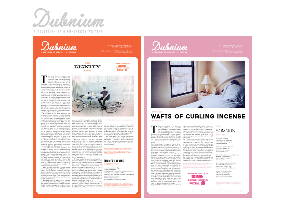
Dubnium is a single-page literary journal distributed monthly inside a high-distribution local street press magazine. In designing the layout for the journal, I wanted to balance readability against a striking visual aesthetic. I also wanted to ensure a high level of consistency between editions while still enabling the form to flexibly support changing content. (This project is ongoing).
Tools, frameworks, and philosophies employed in this project:
Typefaces from the Lost Type Co-Op, a belief that great writing demands attention to presentation.