Before newspapers hit the market, up-to-date information was not easily available. Newspapers offered an ingenious, cost-effective and elegant solution to that problem.
Nowadays, though, the real issue is that there is too much information at our fingertips. News websites are pumping out more and more data, and forcing us to sift through the crap, which can be tiresome. Because we’re inundated with articles, it can be difficult to work out what’s most important, which means that we might miss out on the big stories.
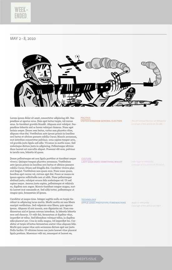
Below is a vague mock-up for the kind of online newspaper I’d desperately like to be reading. The ‘paper’ would be published weekly, and offer a brief analysis of the dozen or so big stories of the past seven days, spread across the realm of politics, culture, technology, fashion, and sport (and so on). The text on the left-hand-side of the page would form a cohesive narrative, tying each news item together in some way. In the central column, each news item would be signposted to give the casual skim-reader a vague outline of the week. The right-hand column would offer ‘jump off’ points: links to coverage of the individual news items in the established media, links to online encyclopaedia articles, videos, and so on.

I’ve decided weekly works best because it gives both journo and reader time to step back and look at news events from a distance. I’m working under the principle that one high-quality post a week beats seven average-quality posts, which in turn beats several hundred mediocre news posts.
What’s the idea with the left-hand-side text forming a cohesive narrative instead of keeping articles separate? Basically, I’m convinced that everything is connected. In the example below, you have a piece on the UK General Election brushing up against coverage of Lady Gaga brushing up against technology coverage of Apple: what connections can we draw? In general conversation, we bounce from topic-to-topic in strange and interesting ways. This newspaper should be intriguing and conversational, as well as informative.
Finally, what’s up with the general lack of photos and images? (I think the idea should be to commission a single artist each issue to produce a beautiful header image that can sum up the news of the week*). Basically, I’m concerned that the web is an incredibly distracting medium. In order to get people reading properly, we need to design websites that can push distractions out of the way instead of proclaiming, “Look here! No, look here!” The structure of each issue should provide a basic reading pattern: top-to-bottom, left-to-right. The far-right column offering ‘jump off’ links is partially faded, because it should be difficult for a reader to click away from the article. There is no navigation bar at the top of the page, because the reader should be encouraged to read their way to the bottom of the page before clicking to another issue.
If any news site like this exists at present, I’d love to hear about it. It’d need to offer a mix of luscious design, an eye for usability, and high-quality journalism. I drive a hard bargain.
* Shout out to Ghostshrimp for the header image in the mockup.
Comments
3 responses to “A Problem-Solving Online Newspaper”
Nice one Connor.
Why is this available online Connor! Someone will steal your idea!
On the actual idea, it’s sort of taking the 5000 idea and applying it to general news huh. I think it would do well to confine itself to explanation as opposed to analysis – I often feel like with fb and all that I get plenty of analysis of the news, often long before I can sit down and understand what’s happened.
If you can get excellent writers who can sum up complex issues in few words and lean away from minute-by-minute blog-style updates (sort of like the ‘Christian Science Monitor’ ethos), it could become a first-stop shop
[…] think he’s hit the nail on the head. In my mockup of a ‘problem-solving online newspaper’, I thought it was important to give readers a […]