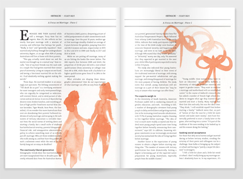
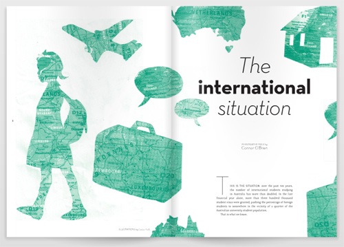
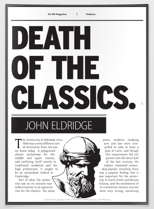
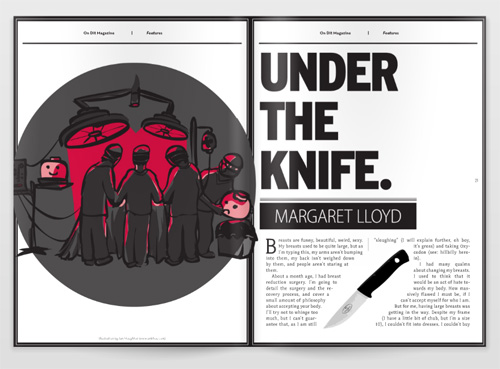
I’m really happy with the way On Dit Magazine is going. I’m even happier with the fact that, from a design perspective, I think each issue keeps getting better and better. In taking a look back at the first issue, I think it’s (visually) a little bland: there’s too much white space, and not enough contrast between graphic elements. In the second and third issues, we received some really breathtaking illustrations, which made it much easier for me to produce appealing spreads (the first two images below are my favourites from those issues). In the latest (fourth) issue, I really took a sledgehammer to the old layout, going for punchy, bold spreads that draw immediate attention.
I tend to freak out about receiving criticism. But (like, duh), we need people around us who can tell us our work kinda sucks (and, importantly, explain why it sucks), so that we can produce better work in the future. By surrounding yourself with yes-men, or hiding your work away from the world, you might save yourself from hearing that you’re not perfect, but you totally miss the opportunity to get better at what you do. Being forced to produce these li’l On Dit babies on a regular basis is great: it means that, instead of worrying about getting things ‘perfect’, I simply have to do the best job I can under tight circumstances. I can look back, cringe at my mistakes, fix ’em, and produce something even better. And then be told, again, that I kinda suck, which leads me to produce better work… and on, and on, ad infinitum.
From top-to-bottom: Issue 2 spread (illustrations by my awesome housemate, Margaret Lloyd); Issue 3 spread (illustrations by Louise Vodic – also awesome); Issue 4 single page (vector graphic by yours truly, based on an free use image from the University of South Florida); Issue 4 spread (illustration by Ian Houghton).


Comments
2 responses to “Design Work: Q1, 2010”
Um, the design for On Dit is breath-takingly excellent. Considering what it was when we were at USC…you’ve really done an amazing job with it.
Sorry I can’t give you any constructive criticism. It’s too good.
Aw, thanks so much Chanelle. You’re awesome.